Brand Identity / Collateral / Fundraising-Development Campaign / Websites (4)
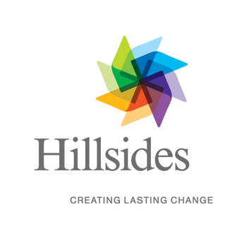
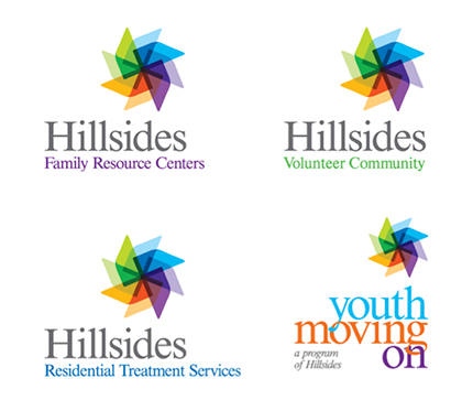
Since 1913, Hillsides has been dedicated to improving the overall well-being and functioning of vulnerable children, youth, and their families. As a result of an extensive research and creative development, a pinwheel concept formed the foundation of the new brand which symbolizes energy, movement, and wish fulfillment, and in some cultures is believed to be an instrument that turns obstacles into opportunities. The brand visuals and tagline were so well received by Hillsides’ board that it became the cornerstone of their four websites and their capital campaign communication. It’s been featured as a benchmark of brand excellence for area non-profits.