Mattel
Global Brand Identity Standards / Logo Development / Corporate Website / Annual Report / Global Citizen Report / Trade Show Graphics / Advertising
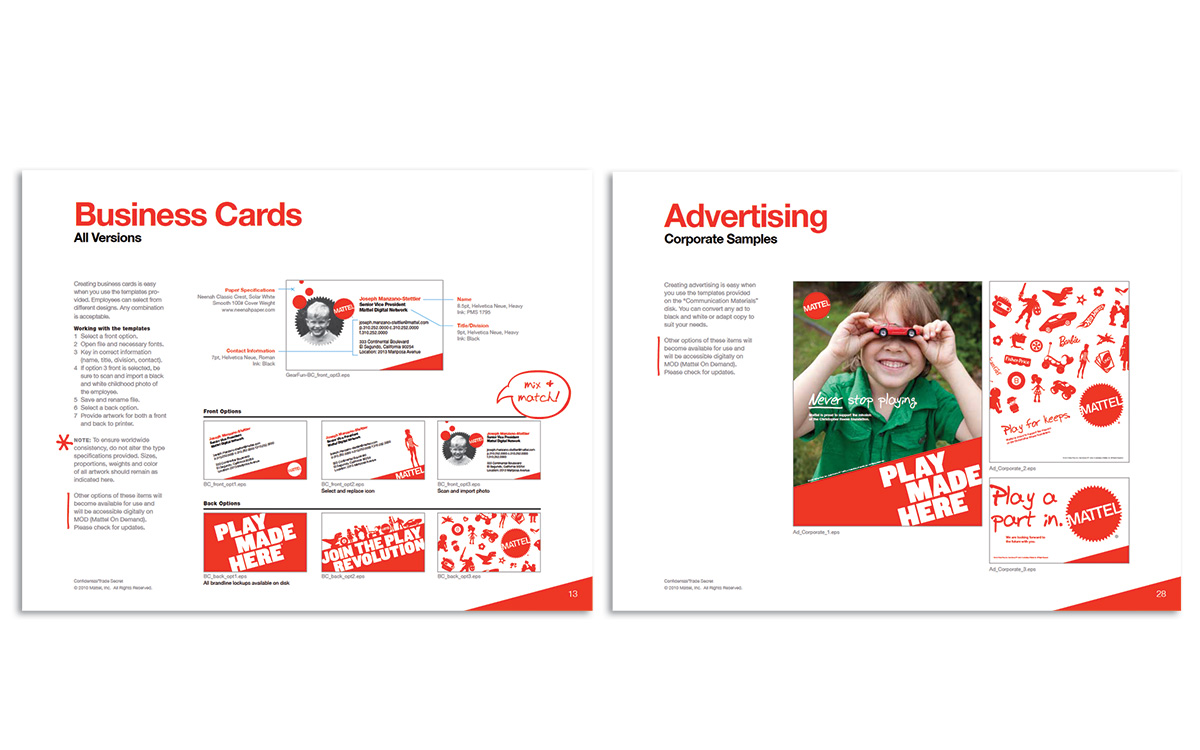
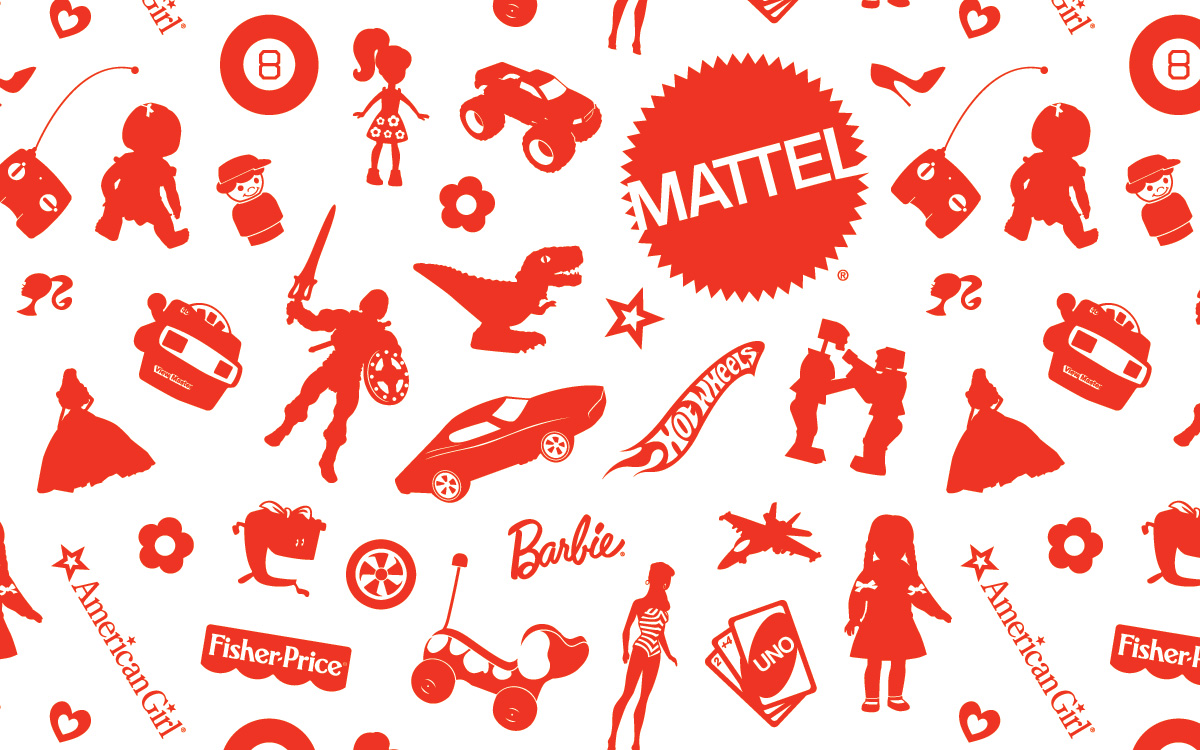
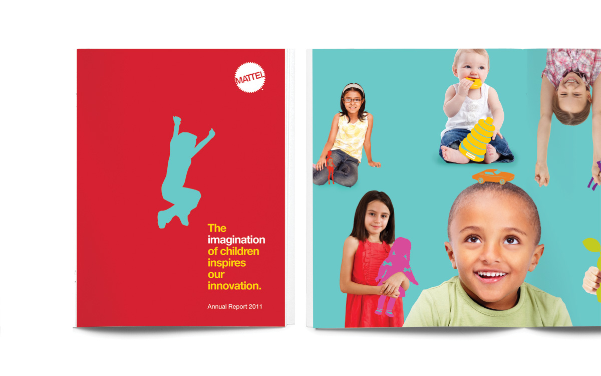
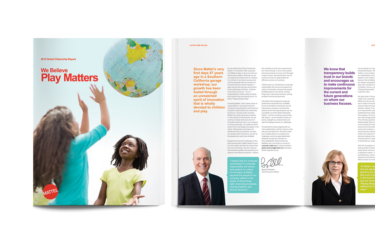
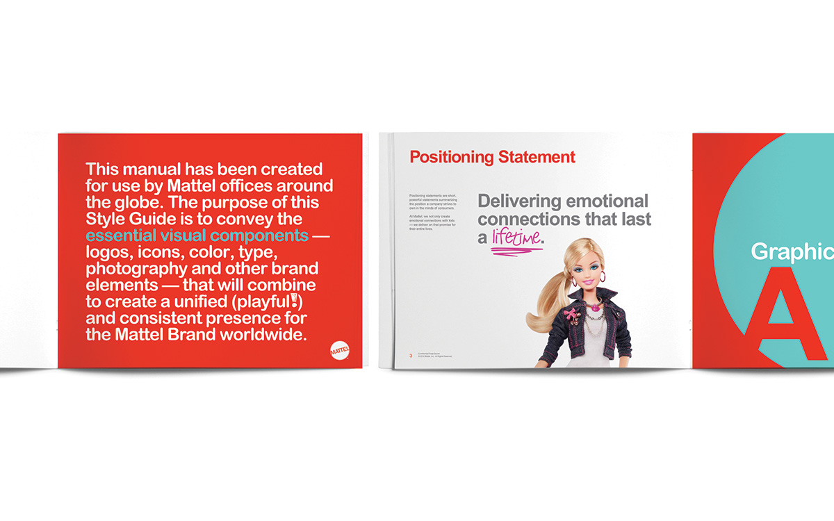
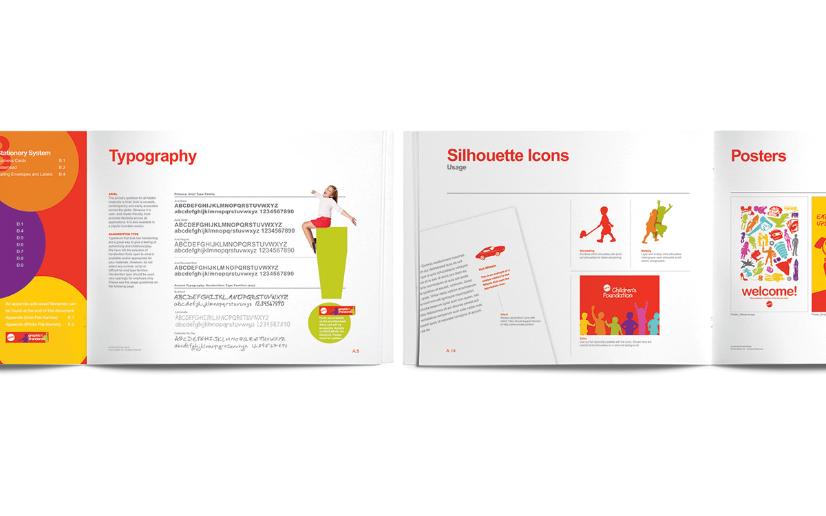
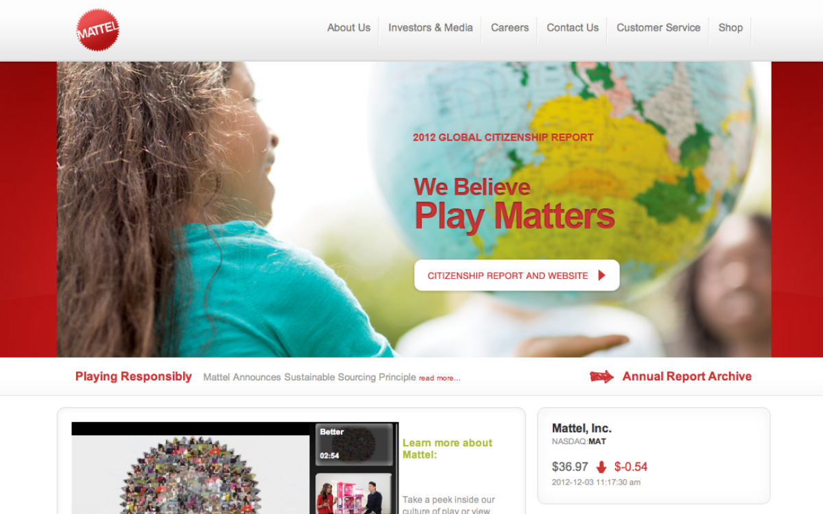
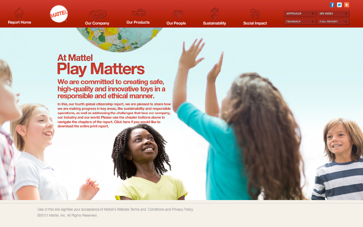
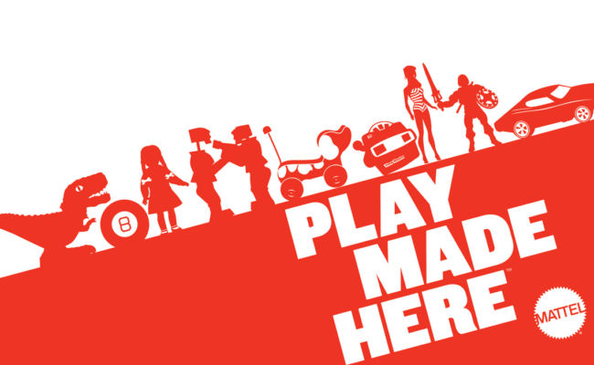
IE created new graphic standards and logos to expand the breadth and depth of the world’s largest toy company’s brand. IE analyzed Mattel from a very wide angle, and utilized its insights from research to explore new logo designs, icons, photography and other design elements to create a more emotive and moving feel for the company. IE aimed to visually represent childhood playfulness and align all of Mattel under their brand strategy, to help achieve this the photography was extremely important and IE set up and creative directed a multi-day photoshoot at several locations throughout the Los Angeles area. The new standards were created to provide the least amount of limitations on Mattel branded creative as possible, while still providing a cohesive structure that will direct the company’s image for years to come.

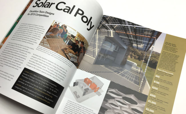
Cal Poly Magazine
Print Magazine Design / Magazine Website Design
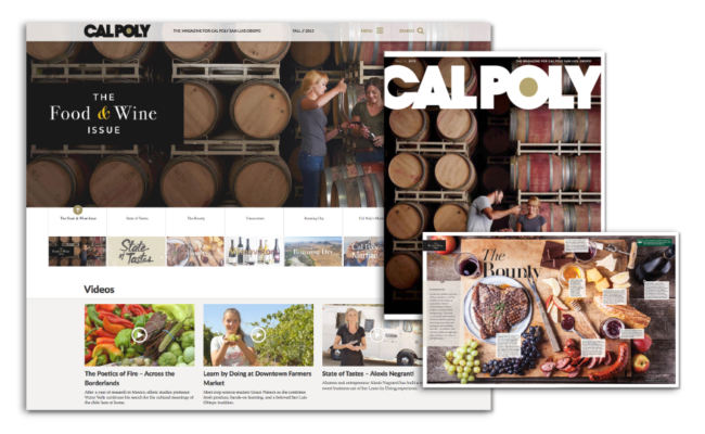
Cal Poly San Luis Obispo asked IE to redesign and the print and online version of the University’s magazine to help further define the University’s brand position, excite and engage audiences, and ultimately foster pride and build broad support for the University. The redesign of the magazine began with a clean sheet. IE and Cal Poly leadership researched stakeholder needs and perceptions, and developed magazine concepts that would support the University brand’s direction. IE presented a series of magazine names and design concepts that were honed through a comprehensive stakeholder engagement process, and then carried the approved concept into the printed piece and feature rich website.

Cornell University
Research / Website Design & Development / Standards
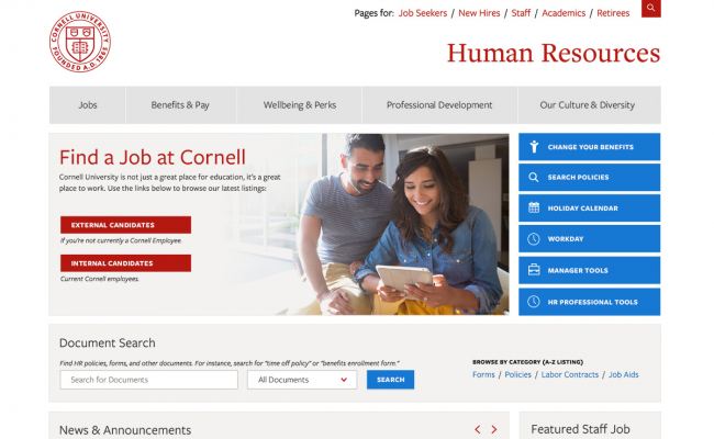
Cornell University, one of the most diverse Ivy League institutions in higher education, employs more than 10,000 faculty and staff in multiple locations across the world. Human Resources has a mission to attract and retain a world-class workforce. Our team was asked to translate over 500 pages of diverse content serving six different audience groups into a modern user-focused experience that enables all members of the workforce, prospective employees, and retirees to easily access information that they need in the quickest, most logical way possible. Through extensive discovery and planning, we were able to develop a design strategy that successfully brought the department’s diverse array of services and resources into a harmonious user experience. The design also echoes Human Resources’ ethos that every employee contributes to the fabric of our community and to the possibility for extraordinary results.

Recording Academy / GRAMMY Awards
Invitation / Event Collateral
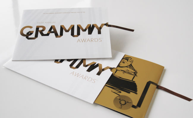
The official artwork of the 55th Annual GRAMMY Awards depicted the iconic Grammy image composed with half-inch studio recording tape. IE was asked to create an invitation for the 55th Annual GRAMMY Awards that conveyed the creativity and craftsmanship of the artists that are being honored. IE interwove traditional and timeless design elements within a clean design throughout the piece to connect the recipient to the soul of the GRAMMYs. The invitation’s design included an actual piece of recording tape that prompts the recipient to pull out the invitation from its sleeve. It was well received by The Recording Academy and its invited guests. The design received praises for its seemingly effortless integration of art and function.

The Academy of Motion Picture Arts & Sciences
Annual Report
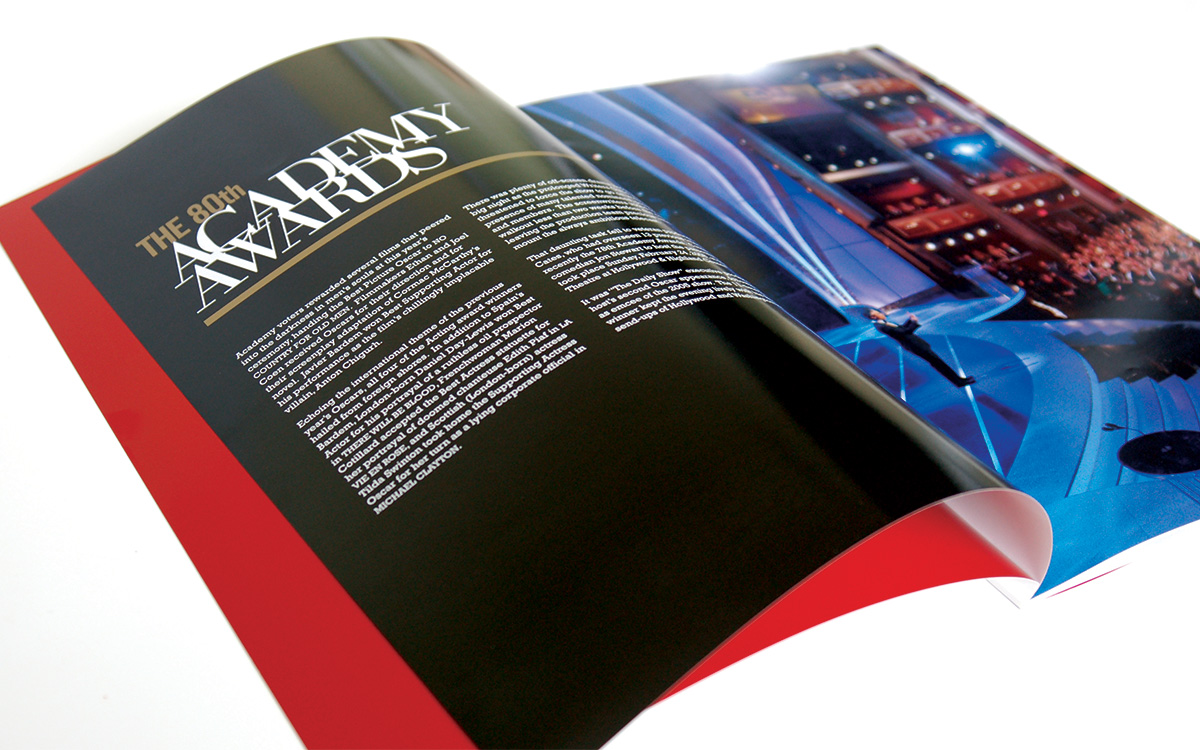
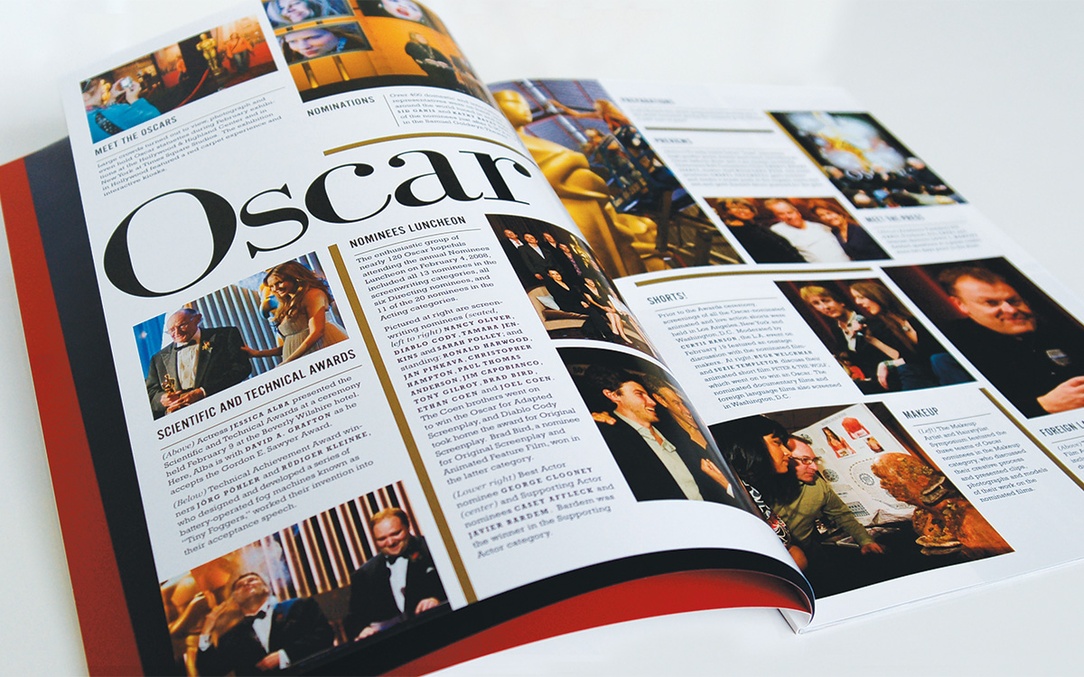
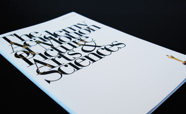
IE Design + Communications partnered with the Academy of Motion Picture Arts & Sciences, the world’s preeminent professional motion pictures organization, to create their annual report. Best known for its annual Oscar telecast, the piece highlights the Academy’s involvement in a wide array of education, outreach, preservation and research activities. Infused with Hollywood prestige and red-carpet glamour, the piece utilizes a visual approach to design with captivating images and unique typographic styles and elements. The annual showcases golden moments of achievement with personal member testimonials. An organization that touches people, the annual report reinforces the Academy’s legacy, community impact and global reach. The annual report was designed in a way that showcases the depth of the organization’s work that goes far beyond the annual Oscar telecast. The piece was so well received that IE designed the Academy’s Annual Report for two consecutive years.

Cornell University
Website Design & Development (5) / Admitted Students Mailer
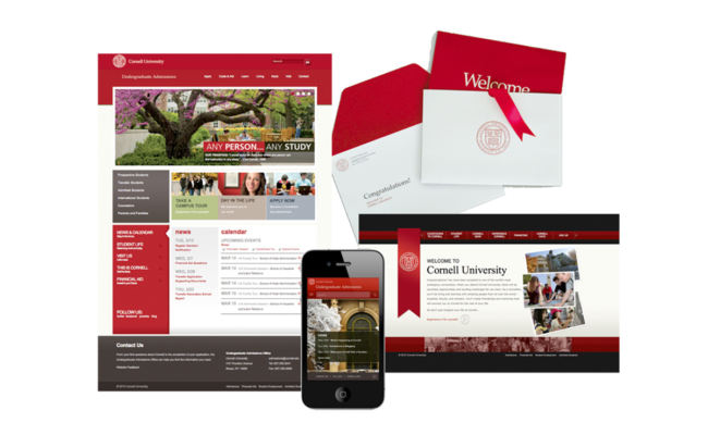
Cornell University approached IE Design + Communications to redesign five of the University’s websites within an expedited time frame of six months in order to coincide with acceptance notices being sent in March to prospective students. Over the course of several years the Undergraduate Admissions, Financial Aid, Student Employment, Admitted Students & Graduate School websites had organically grown unfocused with complicated user experiences and outdated graphics. IE was challenged to redesign and develop the five websites to enable each to connect with its audiences, bolster the University’s online image and provide the University’s staff with an intuitive CMS requiring minimal technical assistance.
In order to meet the challenge of developing five new sites within the relatively short time frame of six months, IE quickly met with the University’s key stakeholders and conducted audience research. A comprehensive roadmap and content plan was created to coordinate the development of all of the sites in unison with expedited milestones.
A decade of experience working with other higher education clients enabled IE to efficiently hone a unique design direction for the five sites, each of which balanced the prestigious legacy of Cornell University with an engaging experience that clearly spoke to each audience. Each site was built within the Drupal content management system (CMS) providing the University with one of the most powerful open-source systems available, offering enterprise level features, strong security and an intuitive administrative environment.
The new sites went live within the originally scheduled six-month timeframe and on budget. Audiences of each site now experience modern designs and succinctly organized and pertinent information. Site administrators now have an easy to use and efficient content management system that will enable the sites to adapt and grow in a well-structured manner for years to come. This design work has garnered a lot of attention and praise. The work has been featured in UCDA‘s Designer magazine, featured by Communications Arts as Webpick of the Week, won the People’s Choice EduStyle Award and won a W3 Silver Award.

DaVita
Research / Brand Strategy / Naming / Brand Identity / Nomenclature System / Stationery System / Standards / Comprehensive Print Systems / Advertising / Direct Mail / Interactive Media / Websites / Signage / Branded Environments
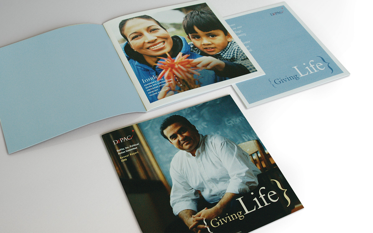
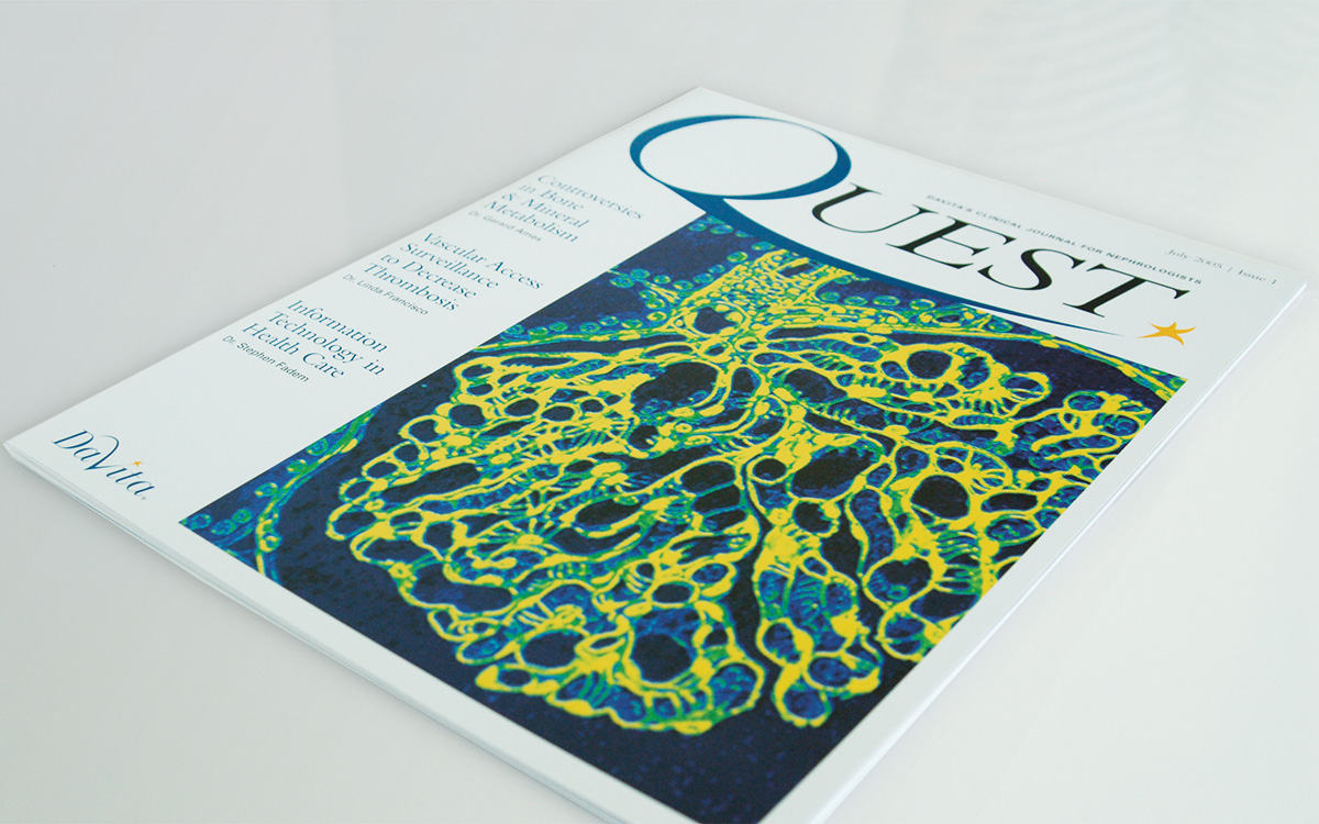
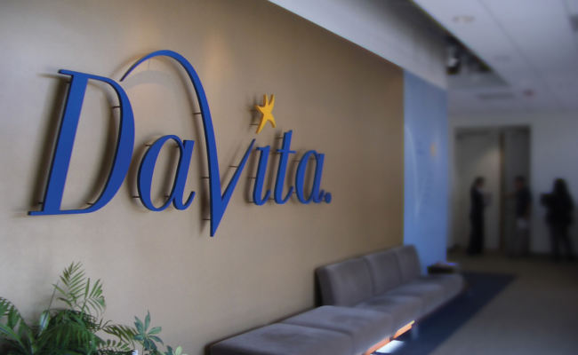
IE served as DaVita’s agency for over a decade handling all creative projects. During that time IE rebranded the company from Total Renal Care to DaVita, loosely meaning that he/she gives life in Italian. The lively swoosh and star in the DaVita logo has become the foundation for the essence of the new brand position. It serves to present DaVita as a forward moving, rising company – which is exactly what has been happening since the corporate rebranding. The company’s stock price climbed over 500% in the first year after the launch and continues to display strength.

USC Annenberg School for Communication and Journalism
Admissions Recruiting Packet
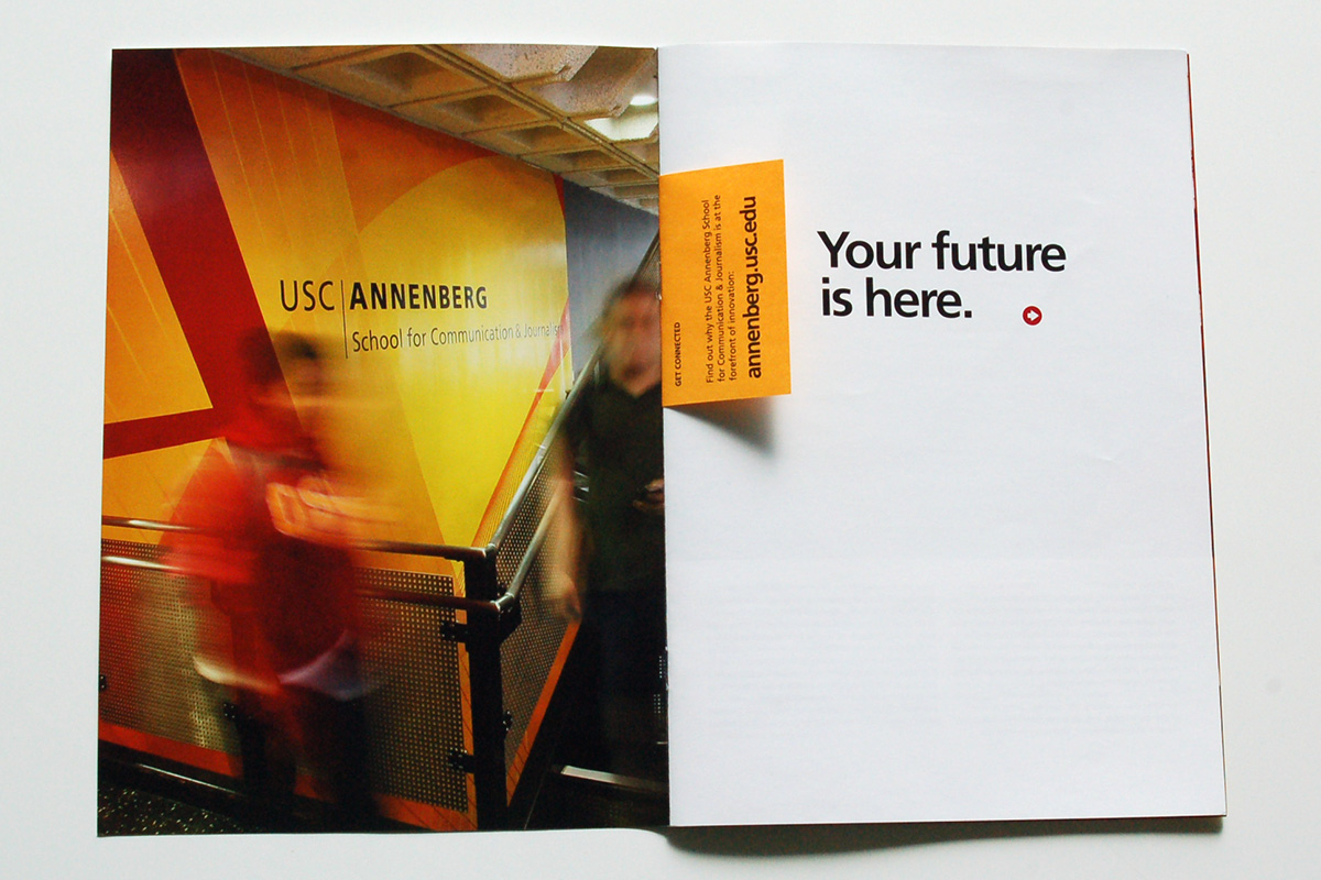
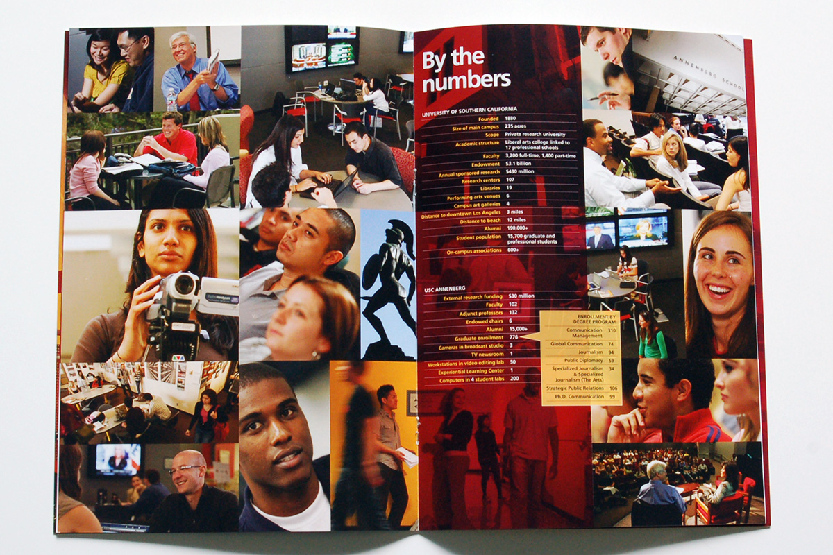
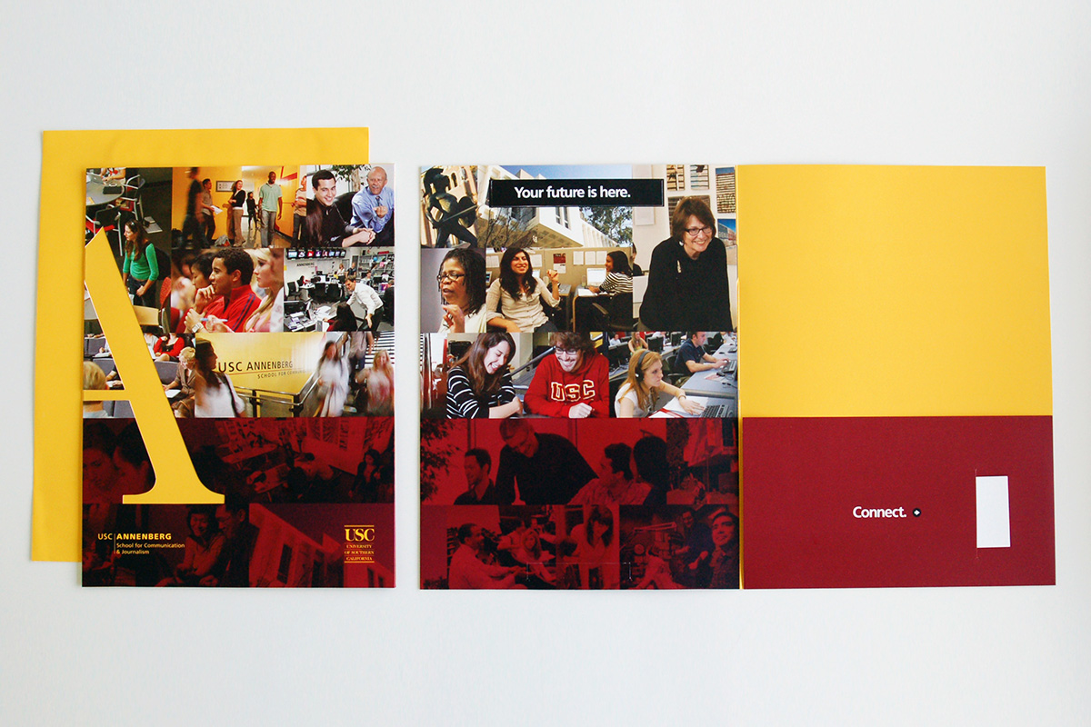
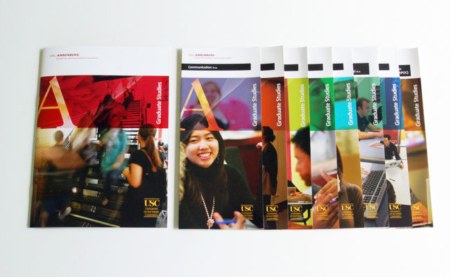
The USC Annenberg School for Communication and Journalism is dynamic and multidisciplinary in scope, offering students some of the most highly regarded communication and journalism programs in the country. In particular the School offers graduate students a range of programs that help students reach their highest potential and thrive in the School’s thought-provoking environment. The School asked IE to develop a print recruiting collateral suite that would ignite the passion and curiosity necessary within prospective graduate students to go back to school, foster risk taking, highlight the advantages of studying in Los Angeles and address how the School can help shape their desired future. The design direction for these pieces broke the mold of the standard non-distinct publications that prospective graduate students commonly encounter. The design direction features the use of an iconic “A”, active photography, and the use of unique colors corresponding to each particular graduate degree program. These elements form the foundation for a set of print pieces that command attention and inspire.

UCLA Law
Campaign Development / Case Statement Book
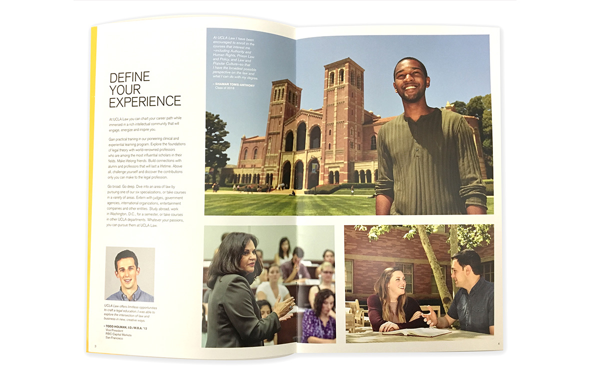
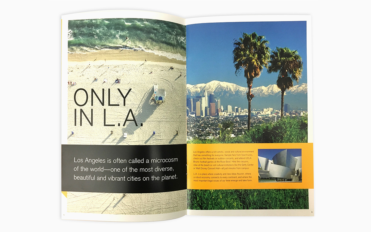
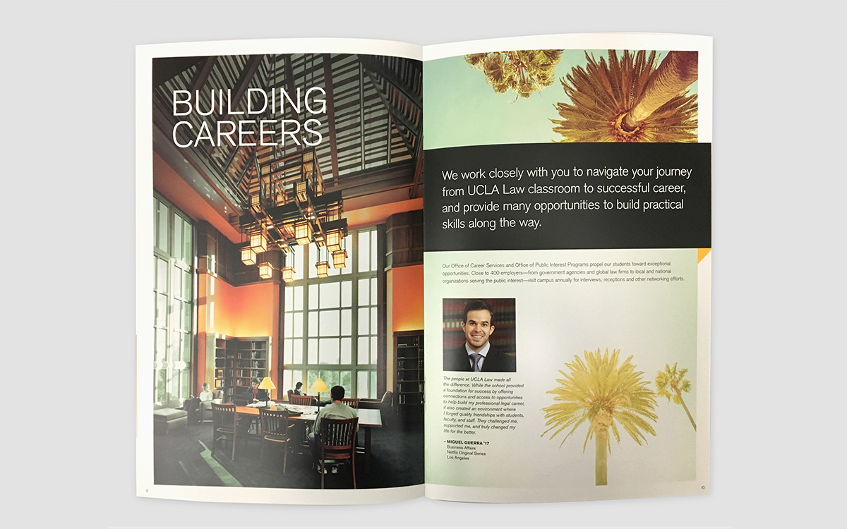
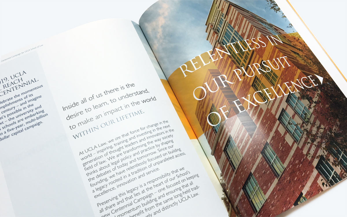
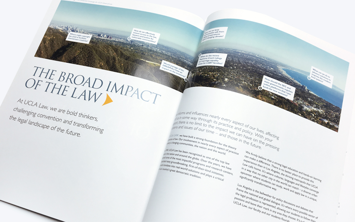
UCLA’s Centennial Campaign aims to raise over $4.2 billion for the University, and UCLA Law is responsible for generating $150 million of that amount. IE worked closely with UCLA Law’s development team, Dean and campaign board to create a communication strategy, visual identity and print materials to drive the campaign.

Hillsides
Brand Identity / Collateral / Fundraising-Development Campaign / Websites (4)
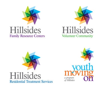
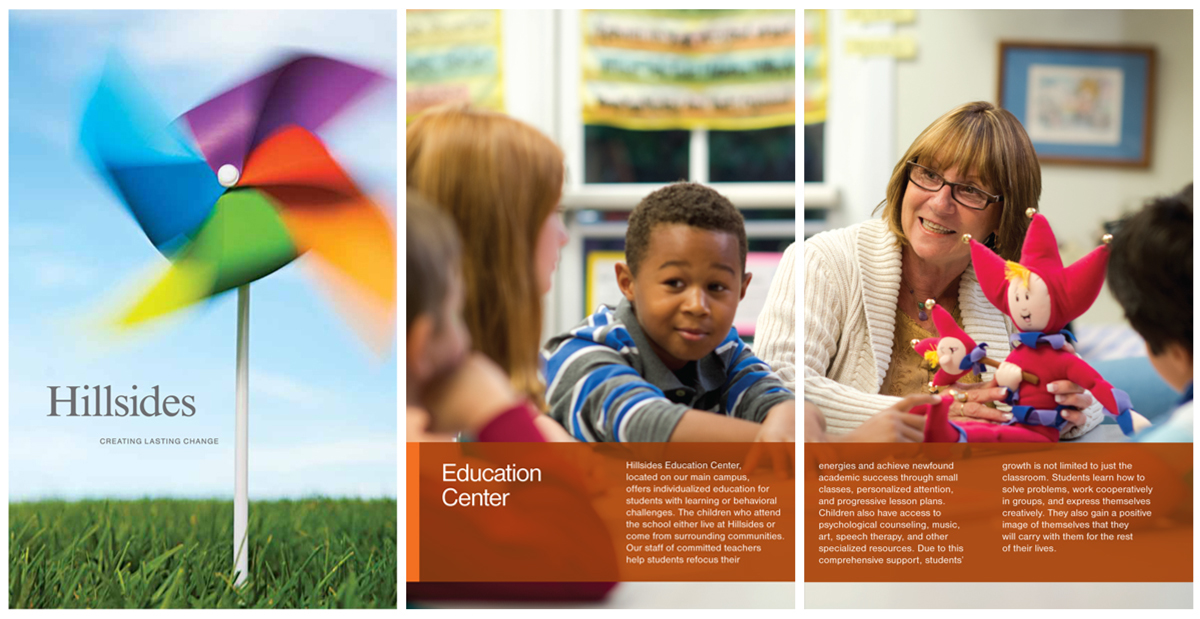
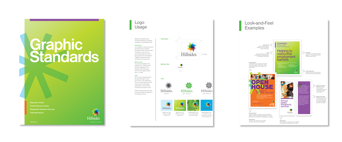
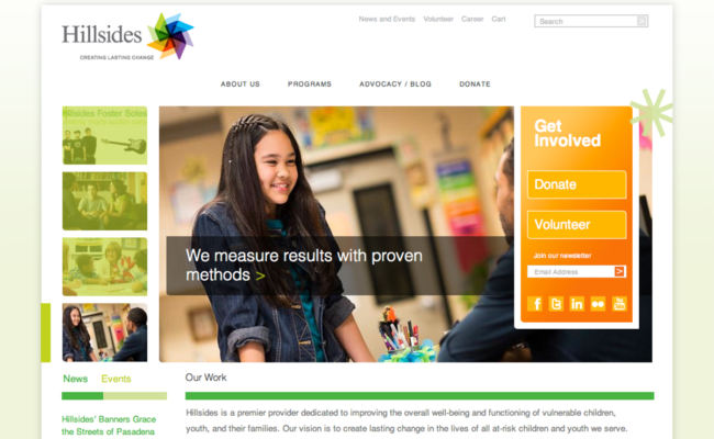
Since 1913, Hillsides has been dedicated to improving the overall well-being and functioning of vulnerable children, youth, and their families. As a result of an extensive research and creative development, a pinwheel concept formed the foundation of the new brand which symbolizes energy, movement, and wish fulfillment, and in some cultures is believed to be an instrument that turns obstacles into opportunities. The brand visuals and tagline were so well received by Hillsides’ board that it became the cornerstone of their four websites and their capital campaign communication. It’s been featured as a benchmark of brand excellence for area non-profits.

SteamDot
Brand Identity / Packaging / Signage / Retail Environments / Collateral / Website
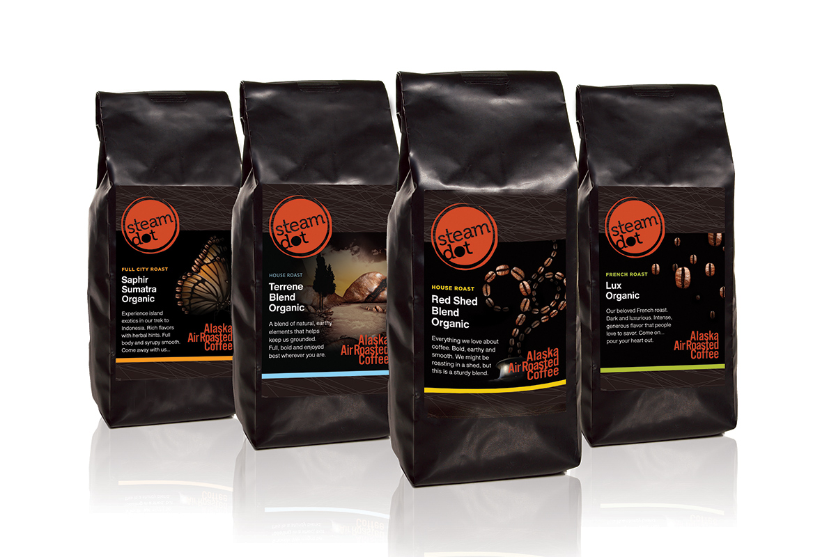
An upstart Alaskan coffee company needed a vision and brand. They came to IE Design + Communications with a blank bag of beans and a clean slate. They needed it all.
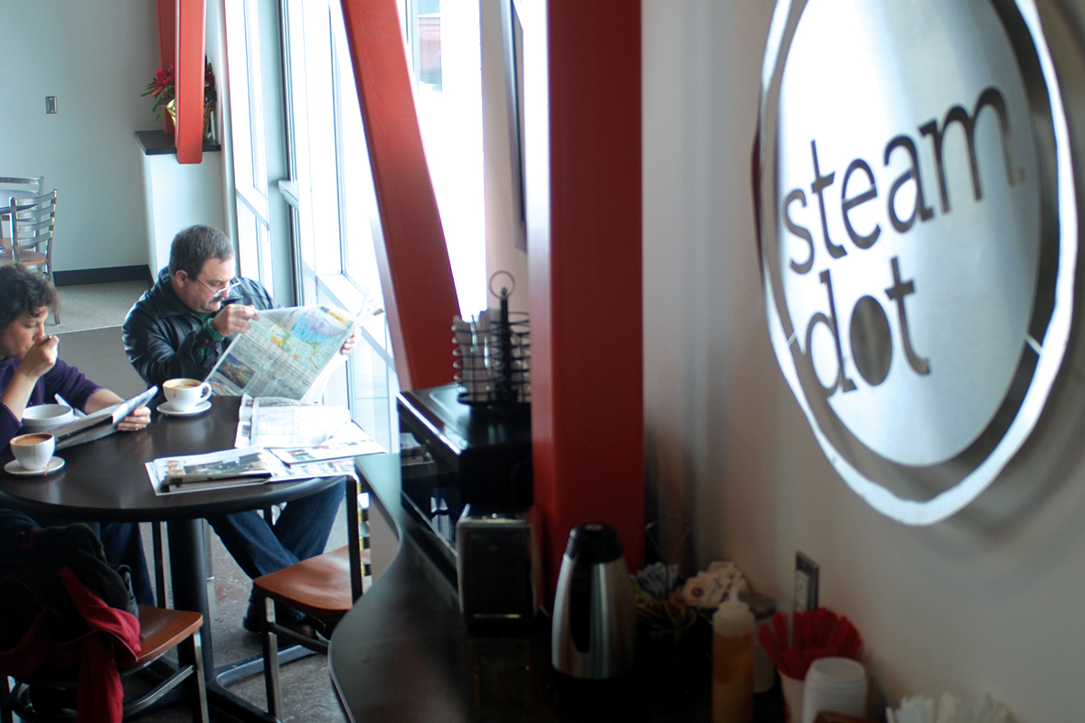
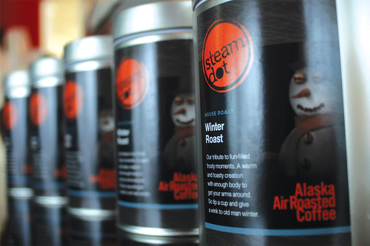
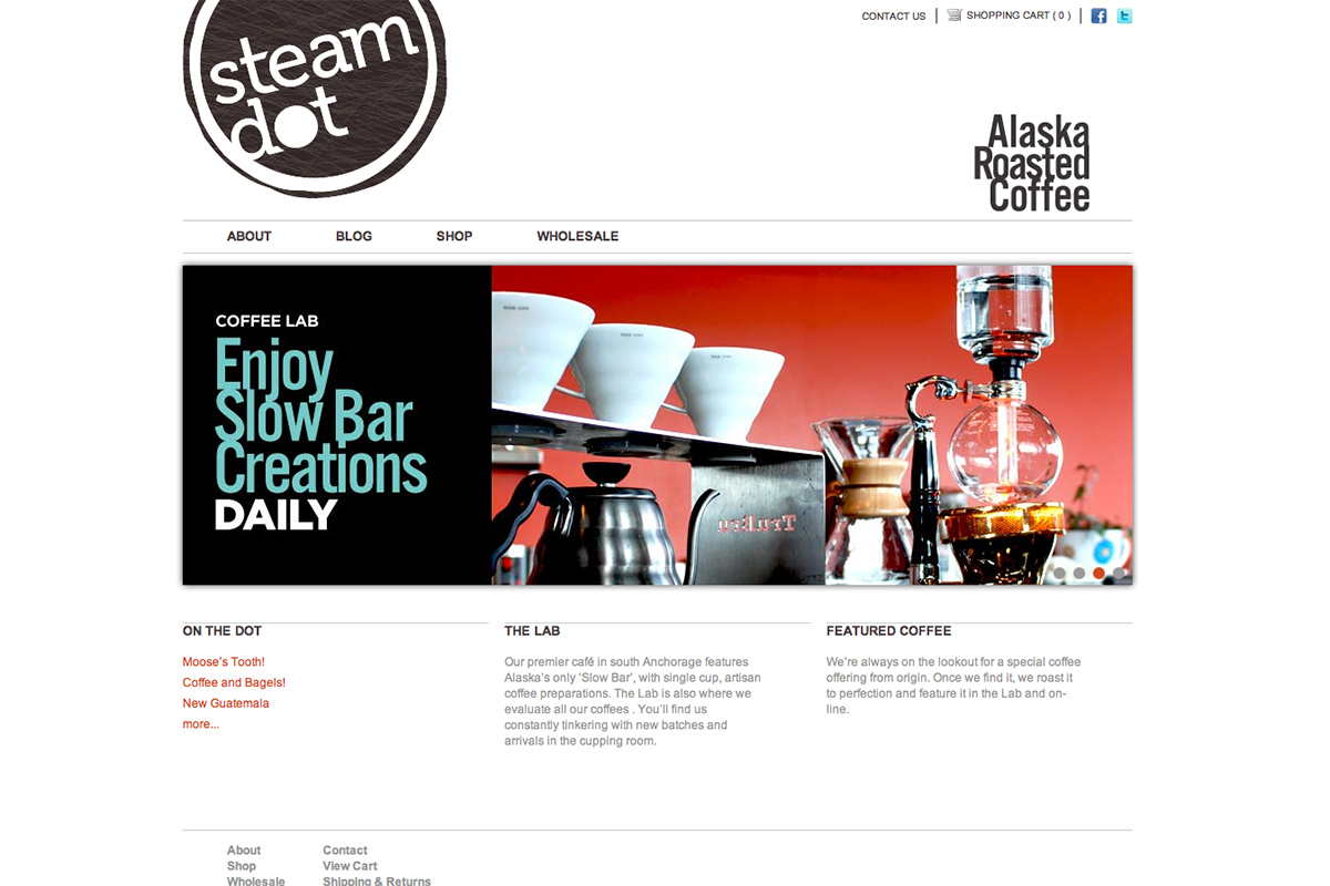
To help the company visualize the possibilities, mood boards were created first. The boards included inspiration drawn from colors, fabrics, patterns, interior and architectural elements, found objects, illustrations and photography. From here a direction of the identity was beginning to take shape—an eclectic, modern mix with a warm and witty personality. The name SteamDot was born from the company’s historic Anchorage Ship Creek location—home to the region’s steam locomotives that dotted the landscape for almost 100 years. We mixed Alaska’s iconic earth characteristics with today’s modern clarity to create a unique brand experience. Coffee collage photo illustrations and playful language was applied to a comprehensive program including, logo design, packaging, signage, retail environments, marketing and business collateral.
In its first year in the marketplace, SteamDot Alaska Coffee has expanded its reach beyond their initially anticipated wholesale market. SteamDot is proudly served in retail establishments such as Alaska’s City Diner restaurant and is the coffee of choice in all Alaska Air boardrooms.

Nature Made
Packaging

Reed College
Website Design & Development / Publication
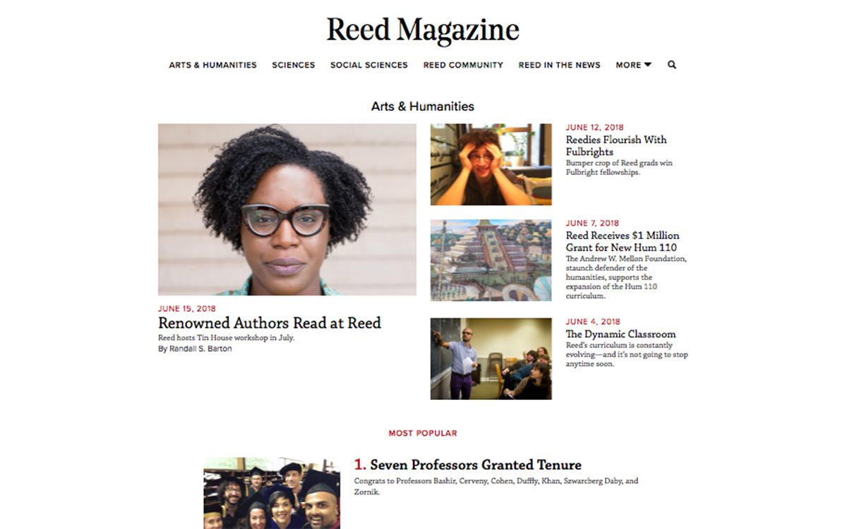
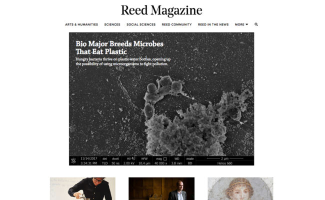
IE worked closely with Reed College’s Public Affairs team to create a digital magazine that could consolidate several disperse Reed “news” related sites into a visually appealing, easy to navigate, and well-curated “go to” site for all of Reed’s audiences.
The goal of the redesign wasn’t to simply create a website that’s a direct extension of the magazine’s print edition, but rather present a wide variety of timely newsworthy content in ways that feel natural to the Reed community and provide depth.
The new site’s design utilized a minimalistic approach that enables the magazine’s content work harder for the College, and further establish Reed as a ferociously intellectual and unconventional place that stirs curiosity and inspires greatness.

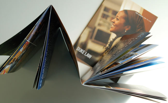
Duke Law
Admissions Recruiting Viewbook

BMW-MINI
Event Graphics / Collateral
The MINI Masters Council Event is an annual conference for their top sales people. IE Design + Communications developed the event collateral: a program folder, luggage tag, contact card and gift cards. The materials were designed to look distinctive, sophisticated and unique; while maintaining the MINI brand. A member of the BMW team wrote us later to say, “Thank you for all of your hard work and the beautiful designs you created for the MINI collateral materials. All of the pieces are unique and cutting edge, just like the MINI.”
Darfur United

UCLA Law
Research / Campaign Development / Case Statement Booklet
UCLA’s Centennial Campaign aims to raise over $4.2 billion for the University, and UCLA Law is responsible for generating $150 million of that amount. IE worked closely with UCLA Law’s development team, Dean and campaign board to create a communication strategy, visual identity and print materials to drive the campaign.
Caltech Associates
Brand Identity / Collateral / Stationery
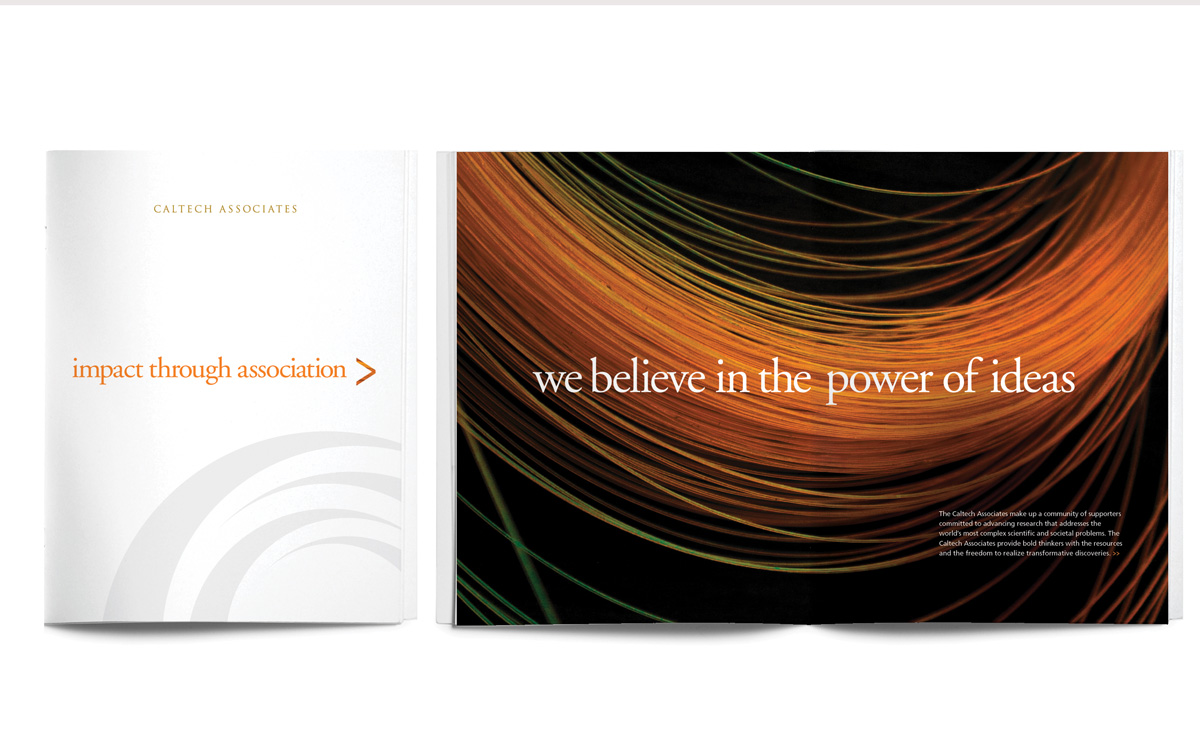
Much of the advanced research at Caltech is made possible by the Caltech Associates, a community of research supporters who have been committed to providing the necessary resources and freedom for pioneering research since 1926. The Caltech Associates approached IE to redesign their aging logo and marketing materials as they no longer represented the organization’s direction and vision for the future. The logo created by IE represents a more modern translation of the iconic arches used within the original Caltech Associates brand. The new logo’s interlocking and arching lines tie the organization’s identity to its legacy, while also conveying a spirit of inspiration and collaboration. The brochure pulled the modern design elements of the new identity together with striking photography and succinct copy to create a powerful piece advocating the unique appeal and rewards of Caltech Associates membership.
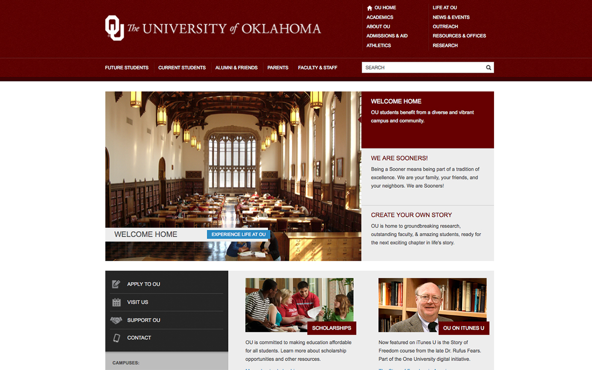
The University of Oklahoma
Website Design & Development
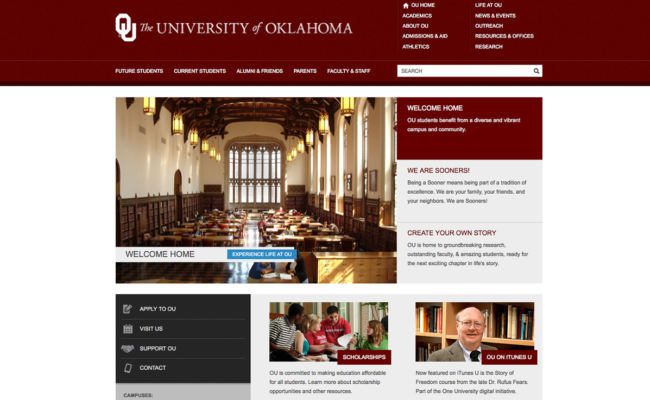
The University of Oklahoma is known for its leading academics and research, a welcoming community, championship athletics and offering the vast opportunities of a large university with the feel of a smaller school. IE Design + Communications was asked to accentuate these attributes when redesigning the University’s website.
OU requested that the new website enable the University’s Web Communications team to promote the OU brand through a content-first model designed to engage and inform audiences.
The University’s Web Communications team conducted extensive research over the course of several months leading up to the site¹s redesign, which included a digital audit, online surveys, analytics analysis and competitive analysis. IE then synthesized the University¹s research into an approach that we believe uniquely addresses the University¹s strategy to engage its audiences through content.
IE was asked to create a crisp and modern design for the University that would be designed to incorporate a more concise navigation structure and use versatile content zones that would allow the University to differentiate itself through branded strategic messaging to its target audiences.

J. Paul Getty Trust
Publication

Manatt, Phelps & Phillips LLP
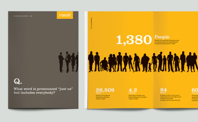
Advertising

Carthage College
Research / Website Design & Development
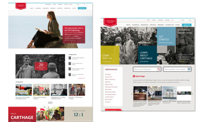
Working closely with Carthage College’s online communications team we created a CASE award winning website that launched the College’s revised brand. The forward leaning design was the result of a collaborative project methodology that included robust engagement from stakeholders from across the campus, which included the President’s Cabinet, Admissions, Communications, Student Groups, Faculty/Staff, Web/Technology, and Institutional Advancement/Alumni Relations.

Cal Poly Center for Innovation and Entrepreneurship (CIE)
Brand Development / Website Design & Development
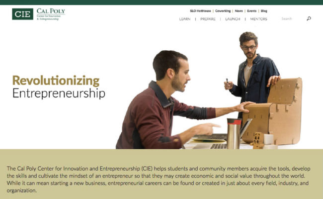
The Cal Poly Center for Innovation and Entrepreneurship (CIE) helps students and community members develop the skills, mindset and network that are necessary to become successful entrepreneurs. CIE turned to IE to capture their brand and an entrepreneurial spirit with the design of a new site that not only markets CIE’s services to the community, but also to industry partners and donors. Since the site’s launch it has received great acclaim from CIE and its peer organizations.

The National Child Traumatic Stress Network
Website Design & Development
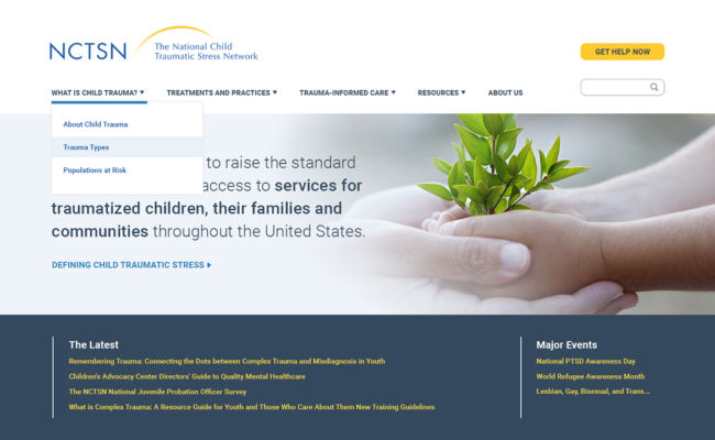
The National Child Traumatic Stress Network (NCTSN) brings comprehensive focus to childhood trauma. It’s committed to raising the standard of care while increasing access to services. NCTSN.org is the public face of the NCTSN and the primary point of access to online resources produced by child trauma experts. Our team redesigned NCTSN.org, that serves over 5,000 daily users and home to an ever growing base of content and resources for child serving professionals (e.g., child welfare workers, teachers, healthcare workers), parents and caregivers as well as youth. Our team created a clean and modern design that more prominently highlights the organization’s strengths and priorities. The new design provides an innovative approach to delivering NCTSN’s breadth of resources through a searchable product database modeled after popular e-commerce solutions that users find familiar and intuitive.

Carthage College Giving Day
Campaign Development / Website
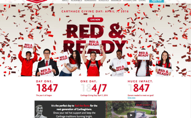
We worked closely with Carthage College’s online communications team and the College’s Office of Institutional Advancement to create a Giving Day website, an online experience that strove to generate donations from new donors over the course of a 24-hour period. 1,873 Carthaginians made a gift to support Carthage programs. More than $326,000 was raised in a single day including the $200,000 challenge gift from the Board of Trustees. The website also picked up a couple CASE awards, Silver for Best Collaborative Program and Gold for Best Individual Webpage.

Cal Poly Annual Report
Annual Report / Website Design & Development
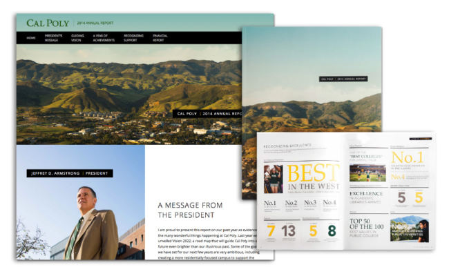
Cal Poly San Luis Obispo wanted to engage its largest donors with an annual report that instills pride in the institution that they support while simultaneously making the case that the University is a cause that’s worthy of their future support and investment. The Annual Report was launched as both a website and printed booklet, the first of its kind to be produced at Cal Poly. It not only showcased the previous year’s achievements, but effectively brought to life all of the historical attributes that have made Cal Poly the great institution it is today. We brought the Cal Poly story to life with large and dramatic imagery, clean and crisp aesthetics, and a tone that invited audiences to play a meaningful and active roll in the Cal Poly experience.

Manhattan Beach Education Foundation
Campaign Development / Advertising / Publications / Event Graphics
The Manhattan Wine Auction is the largest charity wine auction in Southern California offering nearly 2,000 guests annually to experience the best in food and wine while supporting the Manhattan Beach public schools. IE works closely with the Manhattan Beach Education Foundation (MBEF), a community driven fundraising organization, each year to develop the event’s creative concept, materials and promotional campaign. The event consistently raises nearly $1.5 million to ensure the long-term success of our schools and enhanced educational opportunities for our community’s children.

Aspiriant
Direct Mail / Holiday Card
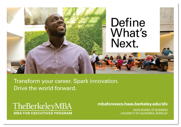
UC Berkeley, Haas School of Business
Advertising Campaign
Undertaking a process that involved an extensive amount of discovery with UC Berkeley Haas MBA for Executives’ students and faculty IE developed the ad campaign “Define What’s Next”. The campaign’s concept was built upon the insight that mid-career professionals who are considering the EMBA program are looking to take control of the next phase of their career. The concept also built upon The UC Berkeley brand attribute of being at the forefront of change. The campaign ran for two years online, within print publications, and on airport displays.
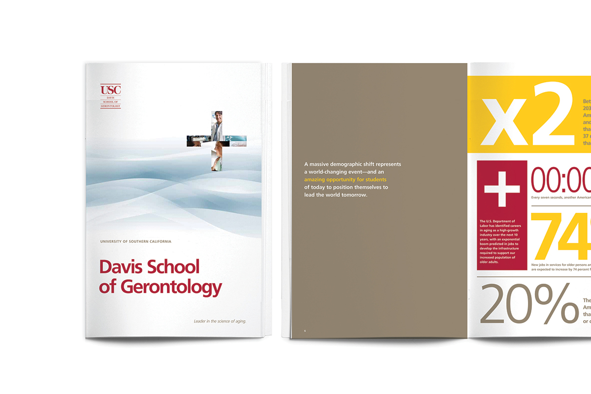

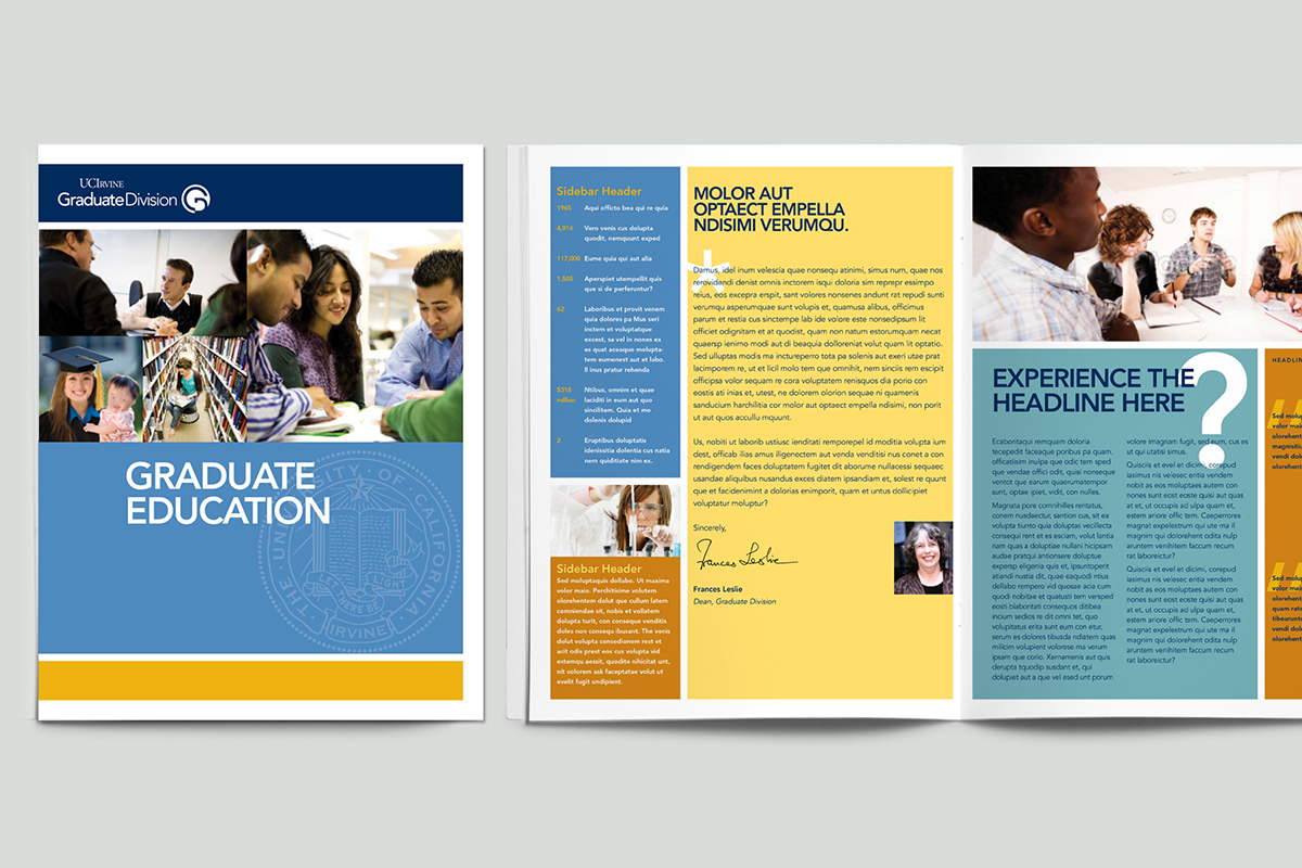
UCI Graduate Division
Brand Identity / Collateral / Website Design & Development / Graphic Standards
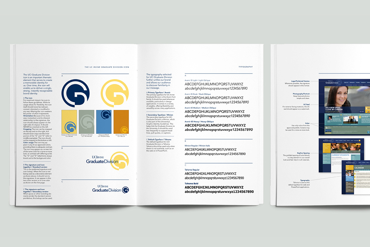
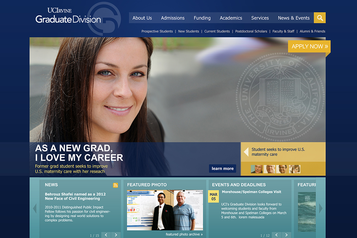
The University of California, Irvine Graduate Division provides a broad range of services to students, faculty and staff across the campus in support of a varying range of graduate affairs, from admissions to commencement. IE guided the Graduate Division through a complete rebranding from the ground up. IE developed a strategy that not only tied the new brand into each touch point of the Division, but provided an overarching plan that enabled it to reign in stray messaging and interweave each service/technology into a cohesive and complementary effort by all parties within the Division. IE’s services brought tighter integration and brand coordination to their communication, and the standards continue to provide steady direction for future initiatives.
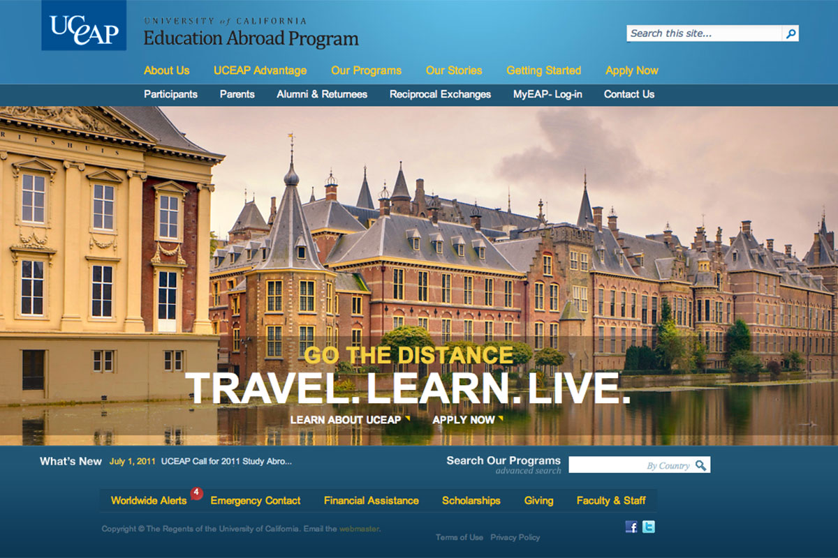
UC Education Abroad Program
Brand Identity / Collateral / Website Design & Development / Graphic Standards
IE conducted a comprehensive audit of the organization and met with key stakeholders to gain a complete understanding of the organization’s vision for the future. We distilled our findings into a strategy that helped direct the design of a modern logo to symbolize everything that the institution truly stands for and where it’s moving — confidence, innovative, creative programs, agility and intellectual energy. In addition, the new identity illustrates UCEAP’s unique offering of inspiring education that’s rooted in the exciting experiences that await students abroad. The new brand created a cohesion that the institution was lacking with its previously fragmented approach. IE also developed graphic standards, print templates, and designed the organization’s website.
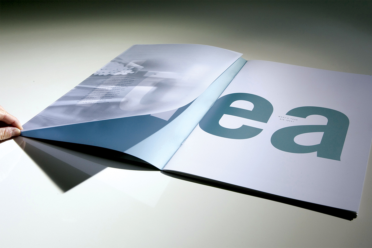
NHK Laboratories
Collateral

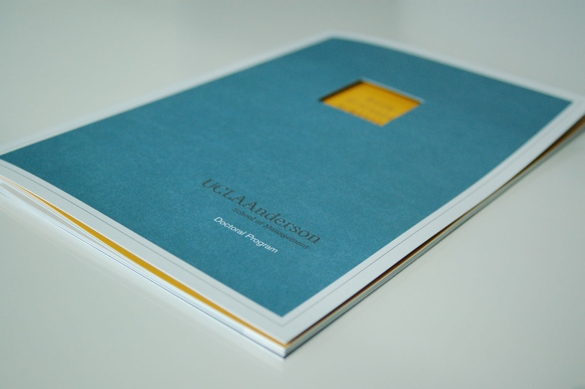
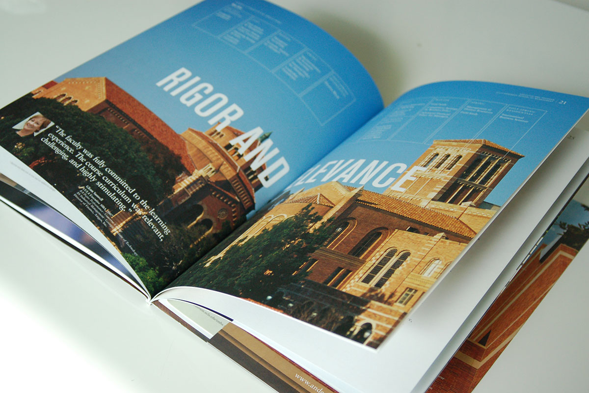
Cal Poly OCOB Graduate Programs
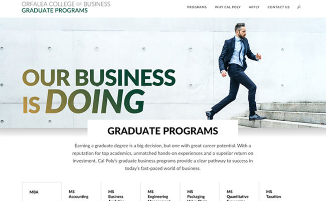
Website Design & Development

Manatt, Phelps & Phillips LLP
Collateral

Cal Poly College of Agriculture, Food and Environmental Sciences

Loyola Law
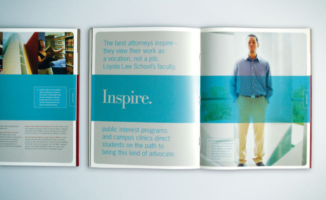
Admissions Recruitment Viewbook

Cal Poly Viewbook
Website Design & Development
We worked closely with Cal Poly’s admissions team to create an engaging online experience that was designed to strengthen the University’s ability to communicate its unique brand story and serve as an online storefront that markets the entire University to prospective students. We developed a design solution that presents the most pertinent admissions info within a streamlined information architecture. The site’s creative concept leverages Cal Poly’s “Learn By Doing” philosophy by inviting prospective students to experience all that Cal Poly has to offer both inside and outside of the classroom.

Beach Cities Health District
Brand Identity / Advertising / Collateral
Beach Cities Health District, a public health facility focused on promoting health and wellness, came to IE Design + Communications for a complete brand identity update. Their existing image was tired and out-of-date. They were in need of a face-lift. IE wanted to give BCHD a more contemporary lifestyle look-and-feel as well as highlight their impressive variety of health classes, tools and resources. Bright colors, bold headlines, energetic animation and healthy imagery all provide the foundation for lots of helpful consumer information. The new brand identity has been an overwhelming success. Their “LiveWell” magazine (also renamed by IE) has received numerous letters from readers praising the new design. Class enrollment has increased since launching the new ad campaign and website.

Classic Litho + Design
iACT
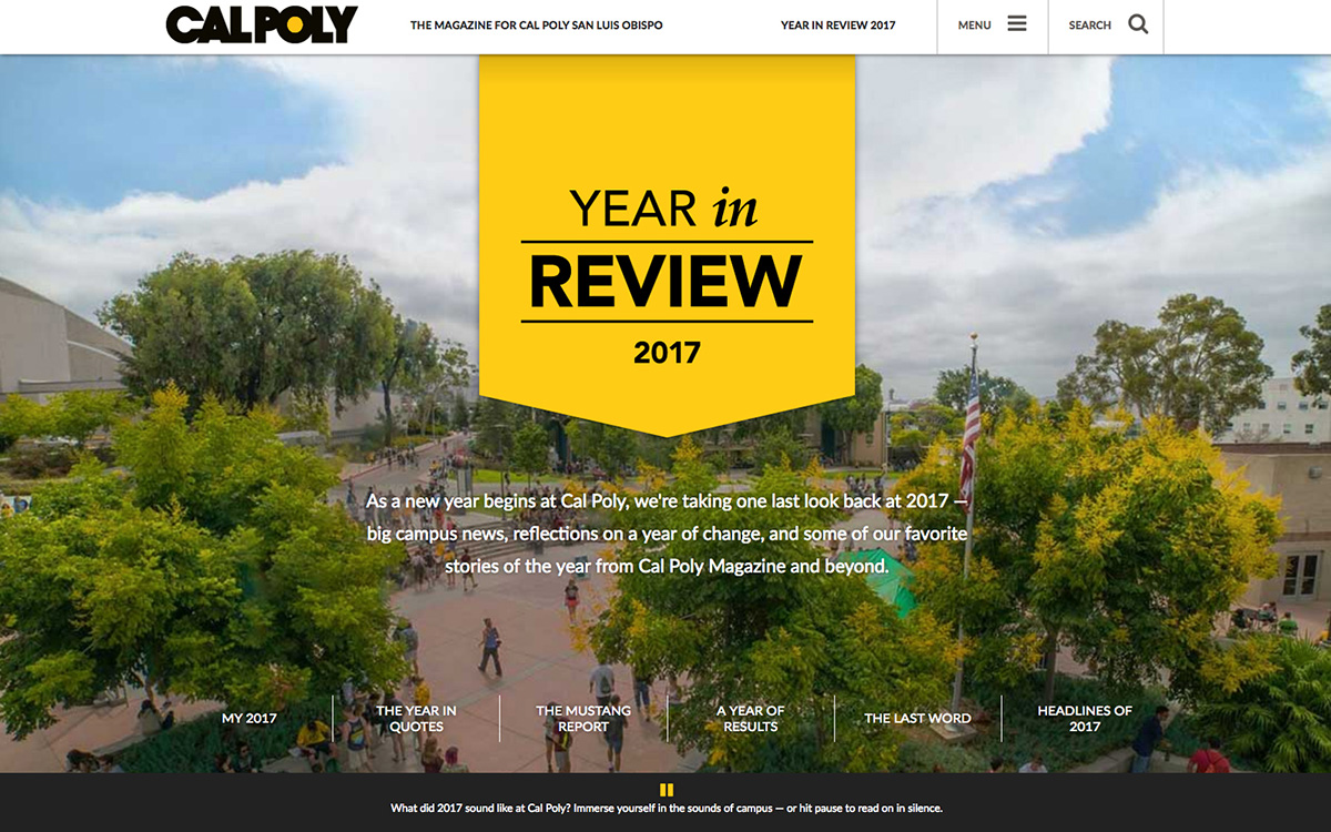
Cal Poly Year In Review
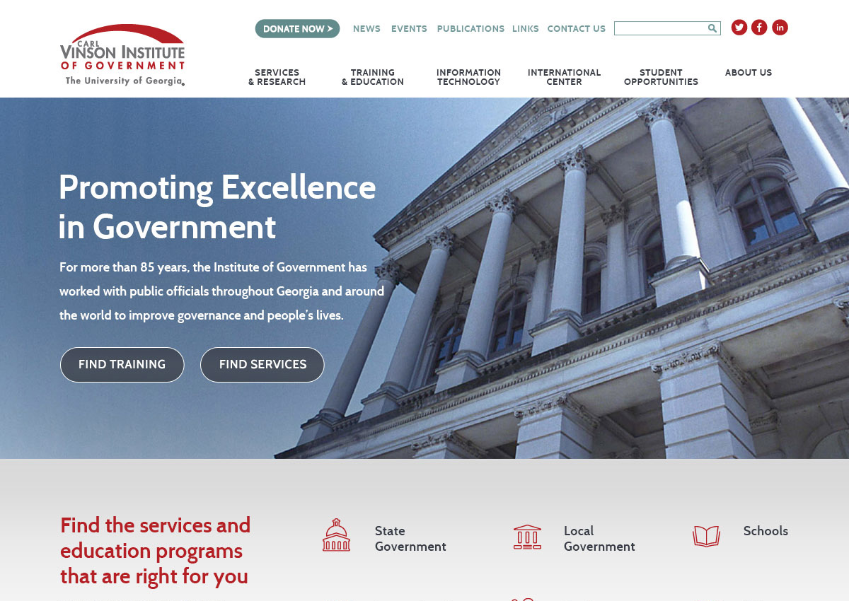
The Carl Vinson Institute of Government
Manhattan Beach Education Foundation
Campaign Development / Advertising / Publications / Event Graphics
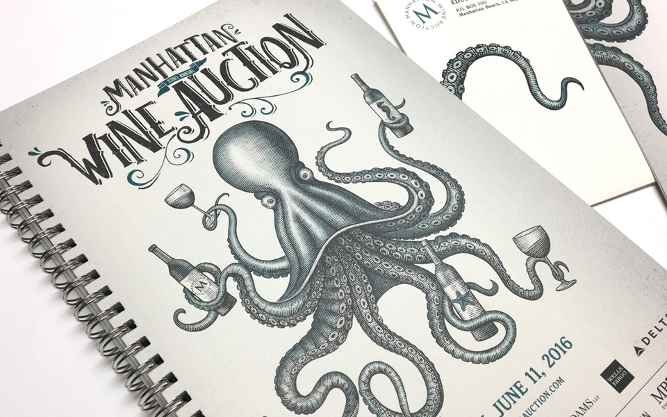
The Manhattan Wine Auction is the largest charity wine auction in Southern California offering nearly 2,000 guests annually to experience the best in food and wine while supporting the Manhattan Beach public schools. IE works closely with the Manhattan Beach Education Foundation (MBEF), a community driven fundraising organization, each year to develop the event’s creative concept, materials and promotional campaign. The event consistently raises nearly $1.5 million to ensure the long-term success of our schools and enhanced educational opportunities for our community’s children.

Cal Poly College of Architecture and Environmental Design
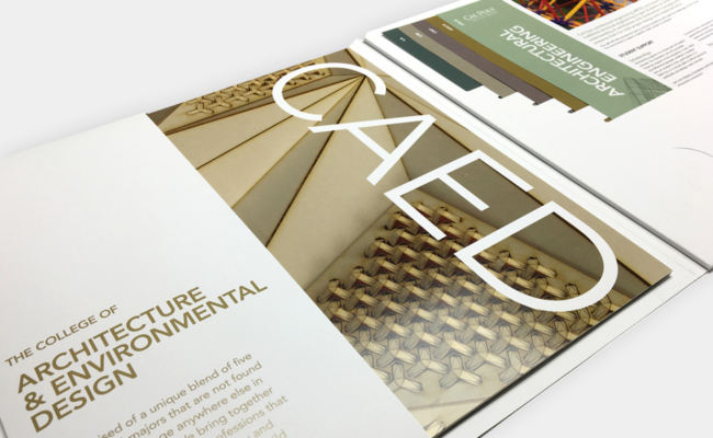
Admissions Recruiting Viewbook

The Campaign for Carthage
Logo / Campaign Development / Website
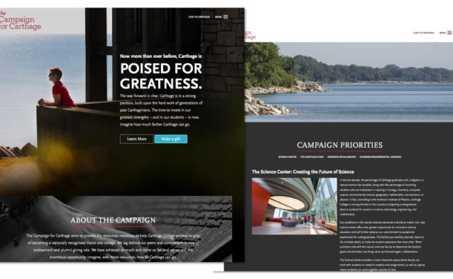
Carthage College has continually turned to us to build a variety of websites, which included the design and development of the Campaign for Carthage site. The Campaign for Carthage set out to raise $35 million for academic facilities, strengthen the endowment, and the creation of new programs and opportunities for the College’s students. We created a website for the campaign that encapsulated the campaign’s priorities, stories of impact, donor honor roll and promoted giving opportunities. The campaign ended up exceeding its $35 million goal, raising more then $45 million.

Cal Poly College of Agriculture, Food and Environmental Sciences
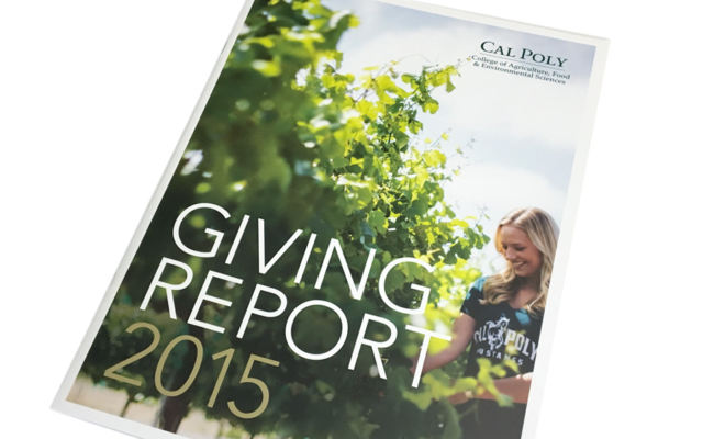
Development Campaign / Collateral
Aspiriant
Research / Brand Strategy / Brand Identity / Standards / Print Materials / Advertising / Website
When two sizable wealth management firms merged to form Aspiriant, one of the largest independent firms in the country, they needed a fresh brand identity that evoked the energetic personality of this aspiring new financial company. The IE team began with a comprehensive audit of the two prior companies and interviewed clients and C-level staff from both firms. We distilled our findings into a comprehensive Creative Brief that became the foundation for the Aspiriant identity system. The modern logo symbolizes everything the company stands for — confidence, energy and sophistication. In addition, it successfully illustrates Aspiriant’s unique ability to integrate disparate financial services to create a clear vantage point for clients to achieve their aspirations. The new identity was developed into an innovative website and comprehensive collateral system. A brand awareness campaign was also developed with announcement materials in both print and interactive that established Aspiriant as the new industry leader.

Cal Poly College of Architecture and Environmental Design
Magazine Design

UC Berkeley Center for Executive Education
Research / Brand Strategy / Collateral / Website Design & Development
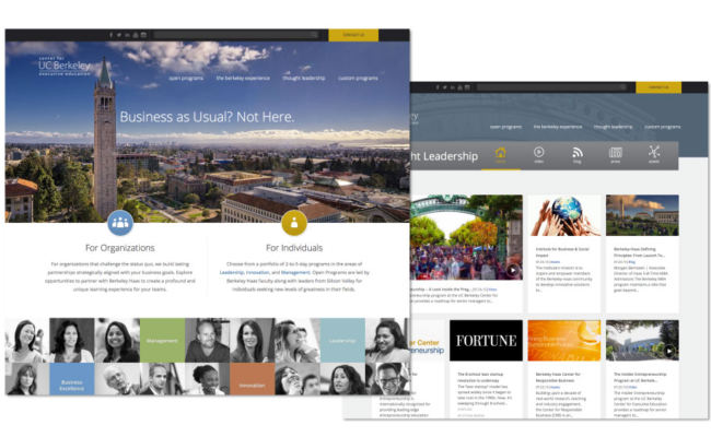
The UC Berkeley Center for Executive Education (CEE) turned to IE Design and Communications (IE) to further develop its brand, messaging, website and collateral. IE began with interviewing over 25 members of the CEE’s clients, faculty, staff and partners. As part of this initial discovery phase IE also spent 2.5 days at CEE’s offices meeting with internal stakeholders and observing executive education programs on the UC Berkeley campus. The insights derived from these interviews combined with CEE’s business strategy were used to form the foundation of CEE’s brand, and identify points of differentiation that should be amplified within the market. Early on in the process the website was identified as its top brand and marketing priority and led development of CEE’s new visual identity.

